Work
Website

My role
Led the end-to-end redesign of the UPI and AA product pages from auditing existing content to defining structure, UI, and interactions.
Team
Geetika and I collaborated on design direction, content hierarchy, and final delivery.
UPI SETU LAUNCH
The Problem
Our existing product pages followed a standard structure but didn’t fully capture the depth and versatility of our offerings. With the UPI page, we wanted to break away from the usual template and create something more engaging and interactive

Pain Points
Navigating sub-products was confusing
Telling the right story
The pages didn’t hold attention
Inconsistent depth of information
The Challenge
We had a tight deadline for the initial launch, this meant we had to make quick decisions and prioritising speed over depth. While the first version got the page live, it didn’t tell the full story of UPI’s capabilities.
"A simple facelift wouldn’t cut it. We needed a clearer, more interactive experience that helped users understand, engage, and take action.
With the UPI product page, we saw a chance to rethink how Setu’s products are showcased"
The Solution
Information Architecture

Some wire-framing..
High fidelity
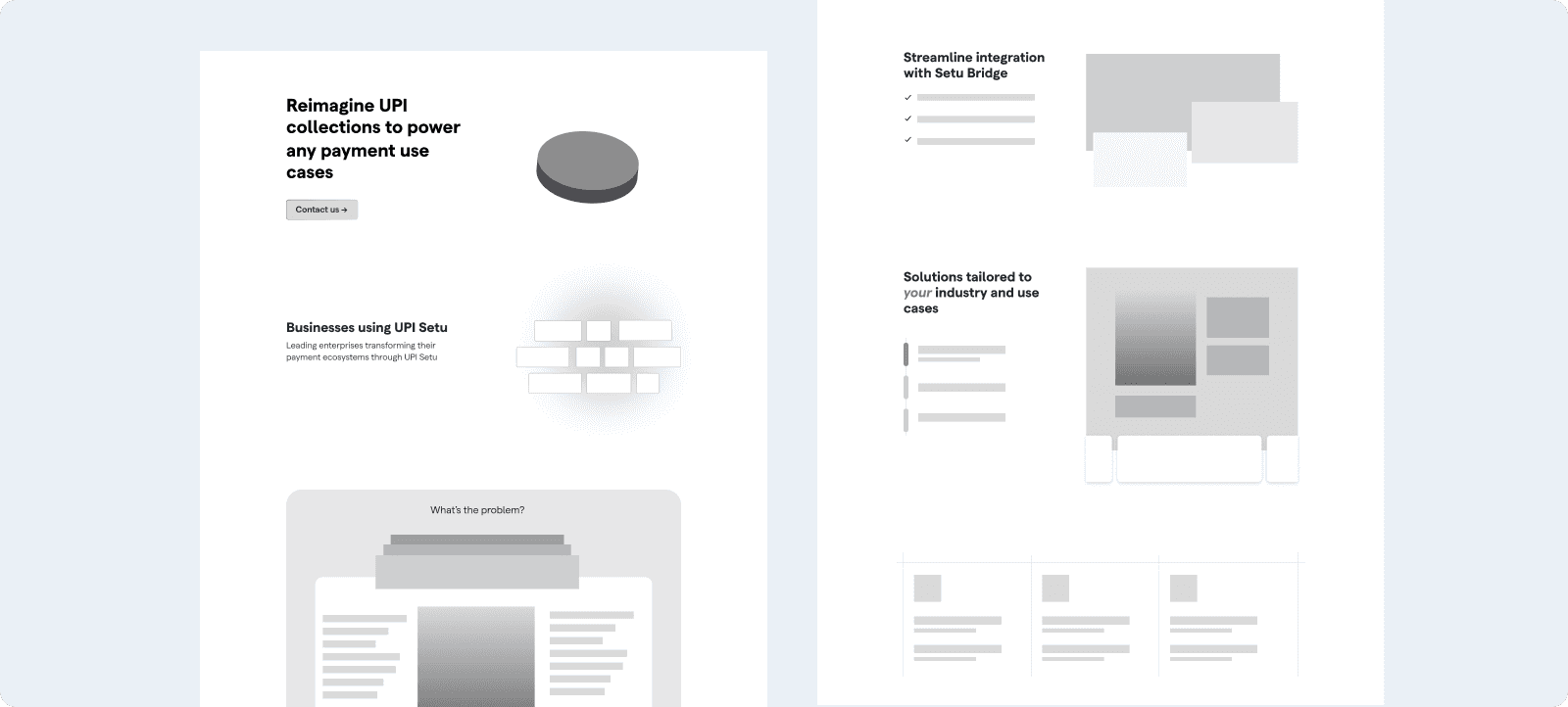
A deep dive into UPI sub-products
One of the biggest challenges was helping users grasp how each UPI offering works without overwhelming them with text. Geetika and I designed a section with interactive previews and custom animations.
To pull this off, I learned After Effects from scratch for this project, which was both exciting and challenging. These animations helped reinforce real-world use-cases, making the product feel more tangible.
How different industries use UPI
I designed a dynamic industry showcase where cards flip to reveal different sectors that benefit from UPI.
Less Space, More Impact:
Instead of a static bento-box layout, I designed this interactive animation that keeps it dynamic without taking up extra space. Different UPI blocks smoothly transition into the view, creating a layered effect that keeps their focus on one card at a time.
Results
15%
increase in businesses clicking the "Get Started" CTA or reaching out for integration details.
40%
fewer support queries related to UPI setup, showing the page effectively answered common questions upfront.
25%
reduction in bounce rates as users found the content more engaging and easy to navigate.
Check out the UPI page here ↗
SETU AA
The Problem
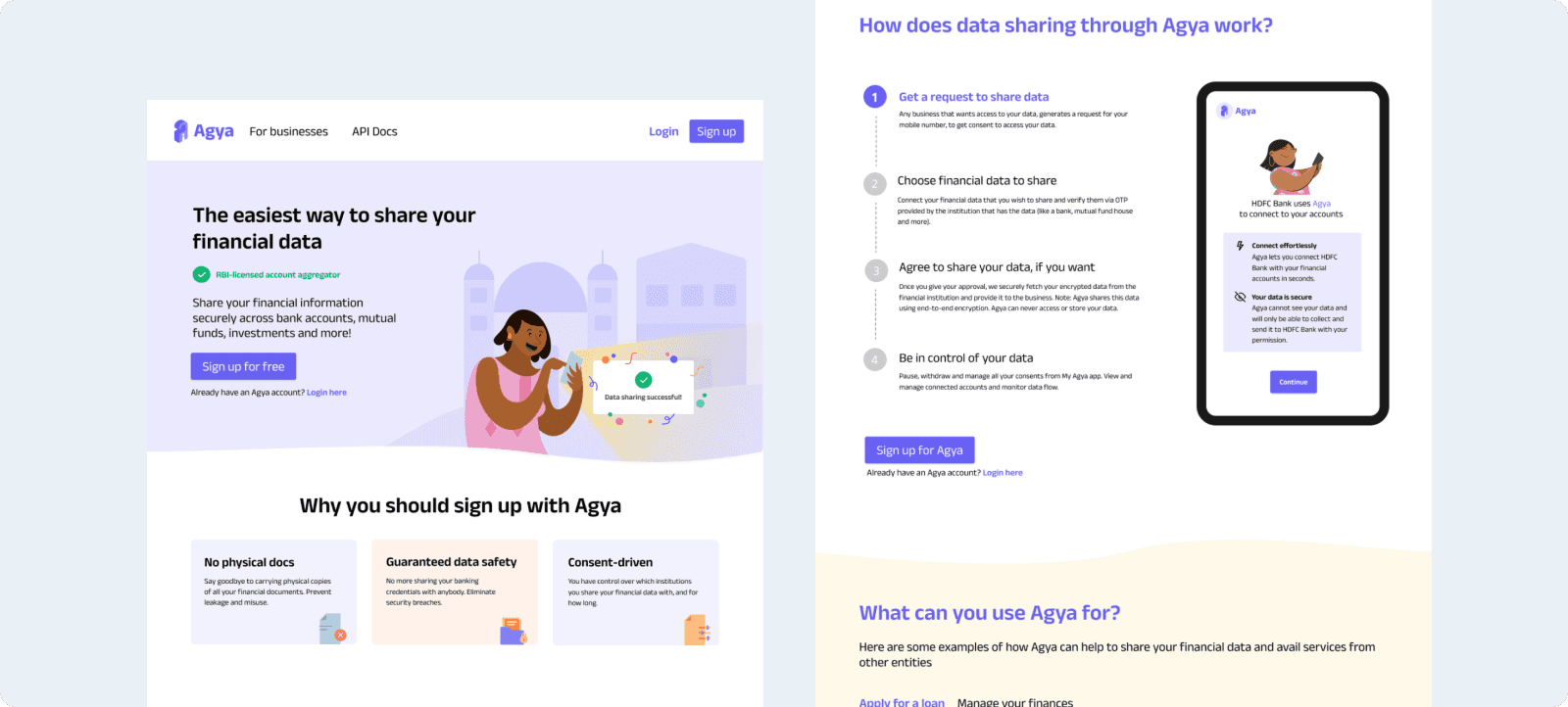
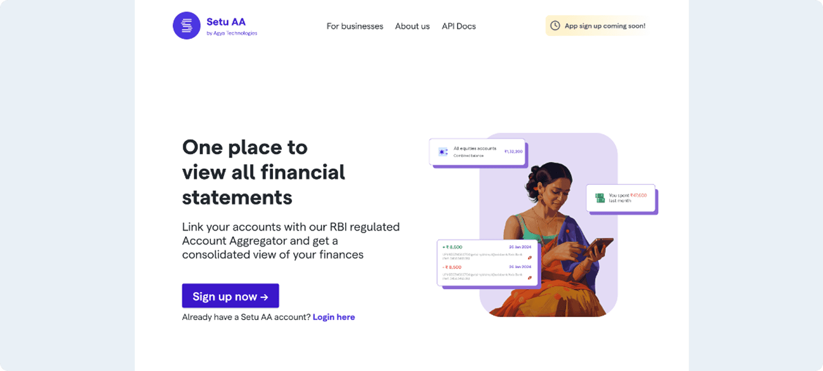
The old Setu AA homepage felt outdated and cluttered, making it hard for users to quickly grasp the product’s value. It was text-heavy with poor visual hierarchy, and lacked interactive elements, resulting in a static and unengaging experience.
Pain Points
Lack of clarity
Missing visual breaks
The Solution
Information Architecture

High fidelity
Nailing the first impression
The illustration in the previous hero section didn’t really capture what Setu AA offers, and the copy lacked impact. To fix this, I collaborated with the marketing team to craft more impactful messaging, and Smriti worked on an illustration that truly represented the product. The result is a hero section that sets the right tone from the get-go.
Showcasing the passbook experience
One thing the previous page missed was highlighting the passbook feature, which is actually pretty cool. In the app, you can view it in landscape mode, and the UI transforms to mimic a real-world passbook. The product team wanted to showcase this in an animation, so we came up with a scroll-stop effect that rotates the phone view into portrait mode, making the transition feel intuitive.
A peek into key features
I wanted to add a bit of fun to the page while giving users a quick look at some of the app’s other features like filters and the ability to view passbooks for different financial data types, such as bank accounts and mutual fund accounts. To do this, I designed a looping tab animation that adds a nice visual break to the page. It was a fun section to work on and brought some much-needed interactivity to the experience.
Results
30%
increase in time spent on the page. With improved visual flow and interactive elements, users were more inclined to explore each section.
Positive feedback
The marketing and product teams received more positive feedback internally and from partners, appreciating the fresh approach and improved storytelling.
Check out the AA page here ↗